Moneta Internet banking redesign
Q1 2020 – Q4 2020

Context
In 2010, Moneta Internet Banking was awarded as the best Internet banking of the year, but very little has changed since then, and technical debt has built up. This led to the leadership deciding on a complete redesign.
A new team has been set up with 2 UX process designers, one design system designer, a UX researcher, and a UX writer. I’ve taken the leadership role and become the owner of this initiative.
This project was complex due to many reasons. Moneta has over a million clients, and daily use of Internet banking ranges around 100k users, from ordinary people who need to send one-off payments or check their balance to big clients and lawyers who manage hundreds of accounts and send significant group payments. Also, each part of Internet banking is owned by different departments, for example, “insurance” or “investments,” and for this project to succeed, all parts of the puzzles needed to be correct.
Why
Improve the overall accessibility, fix the technical debt, and modernize outdated, non-responsive design that no longer serves its purpose.
How
Identify the desired outcomes of the leadership and product owners. Understand technical possibilities, customer expectations, and competitor strengths and weaknesses. Prepare possible solutions and validate them with stakeholders, engineers, and users.
My role
Lead the research and design initiative, act as the design product owner, lead the roadmap planning from the design side, run the workshops, and keep all players aligned.
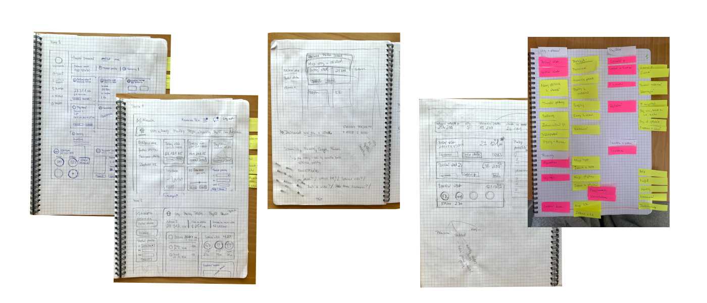
Discovery
We began with stakeholder interviews to define desired outcomes, and together with the researcher, we dived for one month into research and analyzed four years of collected data from user tests, interviews, and feedback. All of this was gathered into the tool Miro, where they were sorted and grouped with a focus on identifying the most liked and disliked features.
This was followed by a deep competitor analysis, including a detailed review of their Internet banking solutions and mapping to our user feedback. Last but not least, we've collected and reviewed analytics data on social demographics, visitors, funnels, screen resolution, and so on.
Based on all the collected data, we defined the proto-personas of our primary users. We wanted to turn them into accurate personas with follow-up user interviews, but unfortunately, time was not playing in our favor, and we had to move to the next stage.
How
Stakeholder interviews
Desk research
Competitors analysis
Data analysis
Proto-personas


Findings
The biggest problem of internet banking was its complexity, lack of clarity, and a divided user base of conservative and progressive users. Furthermore, some conservative users have previously left their banks because of Internet banking changes, which was meaningful learning.
We needed to deliver a simple and intuitive redesign without losing existing clients. A vital part was clear, timely communication with the clients and continuous collection of their feedback.
Design
Based on our research, we've prepared six concepts, ranging from conservative to light refresh to complete overhaul. We've presented these to the rest of the team and selected two winners. Then, we created prototypes for the most frequently used feature: making payments. Finally, usability tests with users from various backgrounds helped us select the final concept. Since we had limited time resources, we did fast iterations between each usability testing session to quickly fix obvious issues and try new ideas.
How
Sketching
Information architecture building
Prototyping
Usability testing
During the designing phase, we faced multiple challenges at once. Mainly visual, function hierarchizations, navigation, and information architecture.


Besides the main areas, we had to design multiple smaller yet very complex flows, such as new device activation.

Final design and next steps
In the next step, we've created a roadmap that has set the order of the design and development of respective features. Priority was given to the payments, including standing orders and direct debits.
A big kick-off meeting I facilitated started and included stakeholders from all departments, such as Internet banking, payments, legal, compliance, and customer support. With the collected data, we began work on the final UX designs, from which prototypes were created, along with the next rounds of user tests.
Each test took place in 1-2 weeks, and results were evaluated and incorporated into new prototypes, and the cycle began anew. Similarly, work on two other sections started in parallel.
Since the beginning of the project, we designed nine sections with multiple features and laid a solid base for a new design system. Sections I owned from a UX perspective were Payments, Settings, and Dashboard.
How
Usability testing
Prototyping
Alignment workshops

Each part had to be consulted with stakeholders from multiple teams, including product owners and engineering teams.


What have I learned?
Designing an app that is being used daily by 100,000+ users and is crucial for their lives was scary and challenging but also very rewarding in the end. It was a massive project, and I had to learn how to navigate between and align many stakeholders with different roles, levels, and competencies.
Another challenge was that at the beginning of this project, COVID-19 started, and we had to transform online. This was something unheard of in traditional conservative banks, where the home office was a rare privilege until now. Meetings, workshops, user research, all of these we all have to learn how to do online. And quickly.
Since I was the only designer working on the old Internet banking until this project, all the designs were in Sketch. Due to the complexity of the new design and the need for collaboration between people, we switched to Figma. So I learned Figma during this project and fall in love with it.
We also knew we couldn’t build a new platform without a proper design system. So, we started to construct a design system at scale. Probably the biggest challenge was that the system had to grow and change quickly, together with the quickly changing and evolving design.
Last but not least, I learned how to manage and align team of 5 people (3 UX Designers, 1 UX Researcher, 1 UX Writer). This was probably my biggest challenge, but I think I handled it well. As proof, there is modern and functional Internet banking running and being used by hundreds of thousands of users as you read this text.
